
The Football Attic‘s entertaining podcast on football books last week stirred my interest in a book called ‘Club Colours,’ by Bob Bickerton, all about football kits.
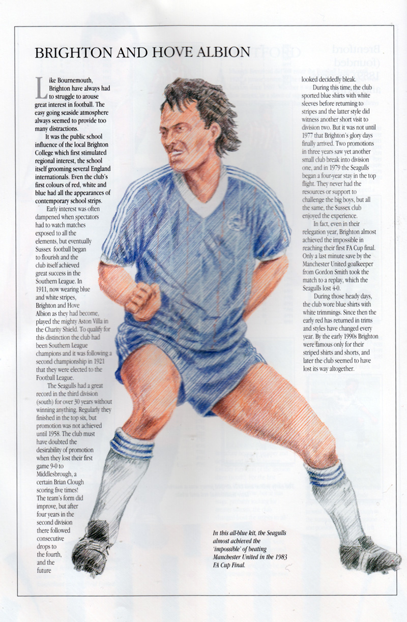
As the price was listed as just a penny on Amazon, I decided it was worth a buy. Inside, every club in the Premier League or Football League is given a double-page spread where the history of its kits is covered with a concise article next to a player in action, illustrated with what looks like… yes… coloured pencils! It makes for a rather eye-catching effect, beautiful in some ways, although as the podcast mentioned, it is perhaps not the most accurate way of capturing the finer detail of a design. Nevertheless, here is the first of the pages on Brighton & Hove Albion, and you can see that the 1983 FA Cup shirt is pretty much spot-on, except for the absence of the adidas logo and ‘FA Cup Finalist 1983’ writing underneath the club crest.
On the page that follows, you can see eight of the respective club’s designs down the years are drawn with fine-liner, pencil and crayons within the boundaries of a cigarette card template. Even so, it’s rather questionable whether Brighton did have red, blue and white stripes or wear red socks as part of a home kit. I can find no evidence of this some years ago, having done some research on this for the creators of the Historical Kits website, a website profoundly inspired by Bickerton’s book.
And if I want to be picky, the accuracy of some of the modern kits looks a bit out without the shirt sponsor or manufacturer’s logo. Perhaps this may have been the result of barriers involved in getting commercial clearance. Even so, this doesn’t explain why the blue shirt with white sleeves kit from the 1960s has a V-neck rather than a round collar. The date is somewhat off too, and similarly it’s the case with the 1970-1976 kit which seems to feature a mishmash of shirts, shorts and socks of different seasons in that period. If you have a look at Historical Kits, you will see what I mean!

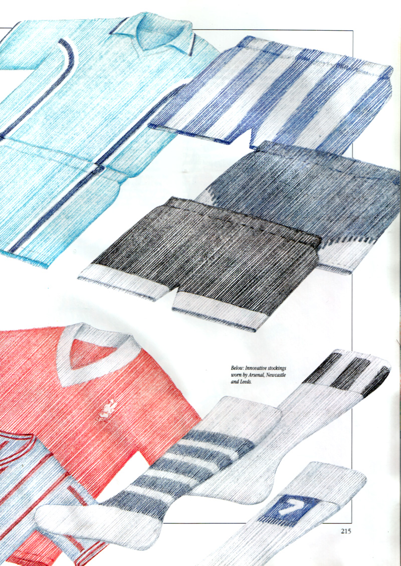
On other pages, covering some trends and new ideas in football shirts, Brighton’s famous deckchair shorts are given a viewing in double-spread entitled ‘Innovators and Innovations’:
The club also features in a section called ‘Hated Away Strips’. Bickerton comments:
The ultimate in this category is the famous red and white wiggly lines version, a pattern which traversed both shirts and shorts of Brighton outfits in 1992. Certainly, such was the strength of the irregular pattern that it was difficult to focus on the shape of the player in action.
The illustration of this kit most pointedly reveals the limitations of drawing modern kits with coloured pencils as it doesn’t quite capture the detail of the pattern. As a result, it’s clear that the vector-based software illustrated kits of the Historical Kits website, and John Devlin’s magnificent ‘True Colours’ books and site, have somewhat eclipsed what ‘Club Colours’ set out to do. Even so, this is a splendid book that is undoubtedly written with a lot of love and fascination for its subject matter, and it provided a valuable place of reference at a time when there weren’t that many books or websites on football shirt design. Definitely worth a penny of anyone’s money!


I have also done extensive research on Albion kits and the tri-stripe is (pardon the pun) red herring. As you say it was a slip of the cigarette card crayon! No red socks in the 50’s either.