As a long-term fan of The Football Attic, I was delighted to see Brighton & Hove Albion’s snazzy home kit from the mid-1980s make it into Chris and Richard’s countdown of the the Greatest Football Shirts Ever, as chosen with Jay from Design Football and John Devlin of True Colours.
There’s a nice write-up by John Devlin, as well as a Football Attic podcast discussing it, complete with some great NOBO gags. Well worth a listen 🙂
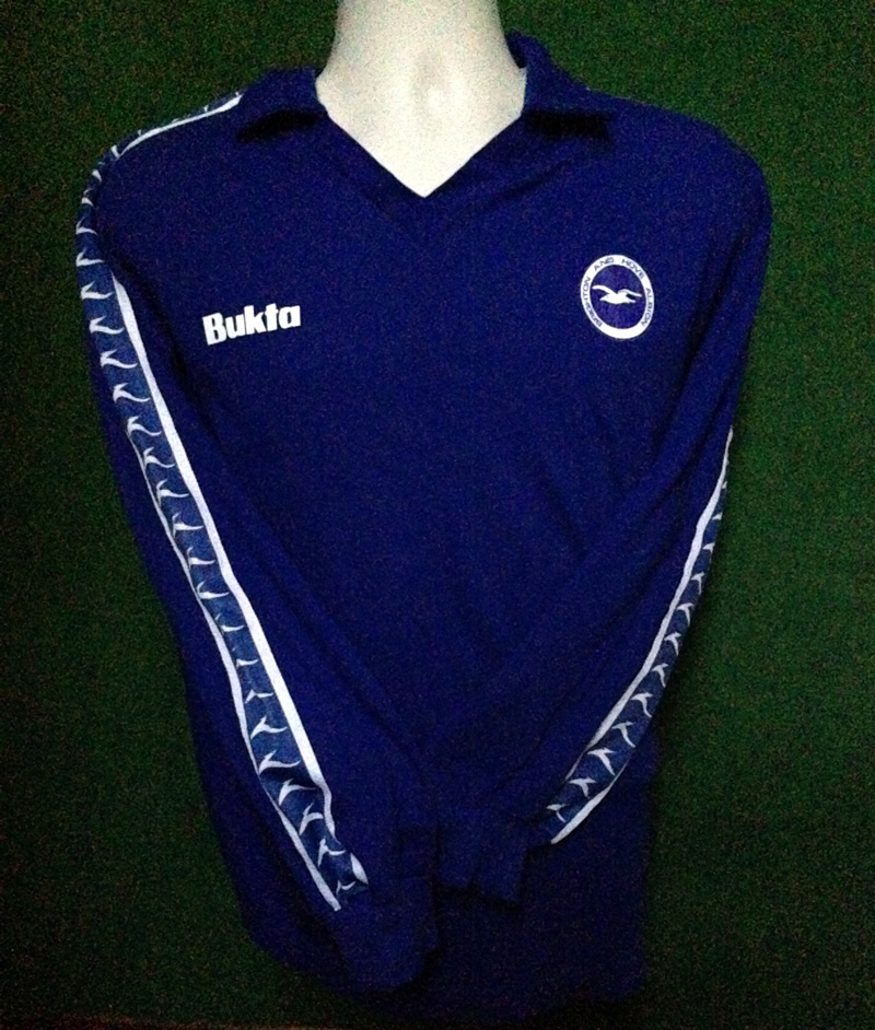
It seems slightly absurd that a team that plays in blue and white would choose an away kit that was …blue and white. However, that’s how things were in 1977 when Bukta won the contract for supplying Brighton & Hove Albion’s kit:
The advantage was that the Seagulls could maintain their home colours (albeit not their home kit) on away trips to Southampton, Sunderland, Stoke and Crystal Palace in the Second Division in 1977/78. The downside was that it necessitated that Bukta supplied Albion with the extravagance of a third kit, with red shirts, for matches at the likes of Oldham and Millwall.
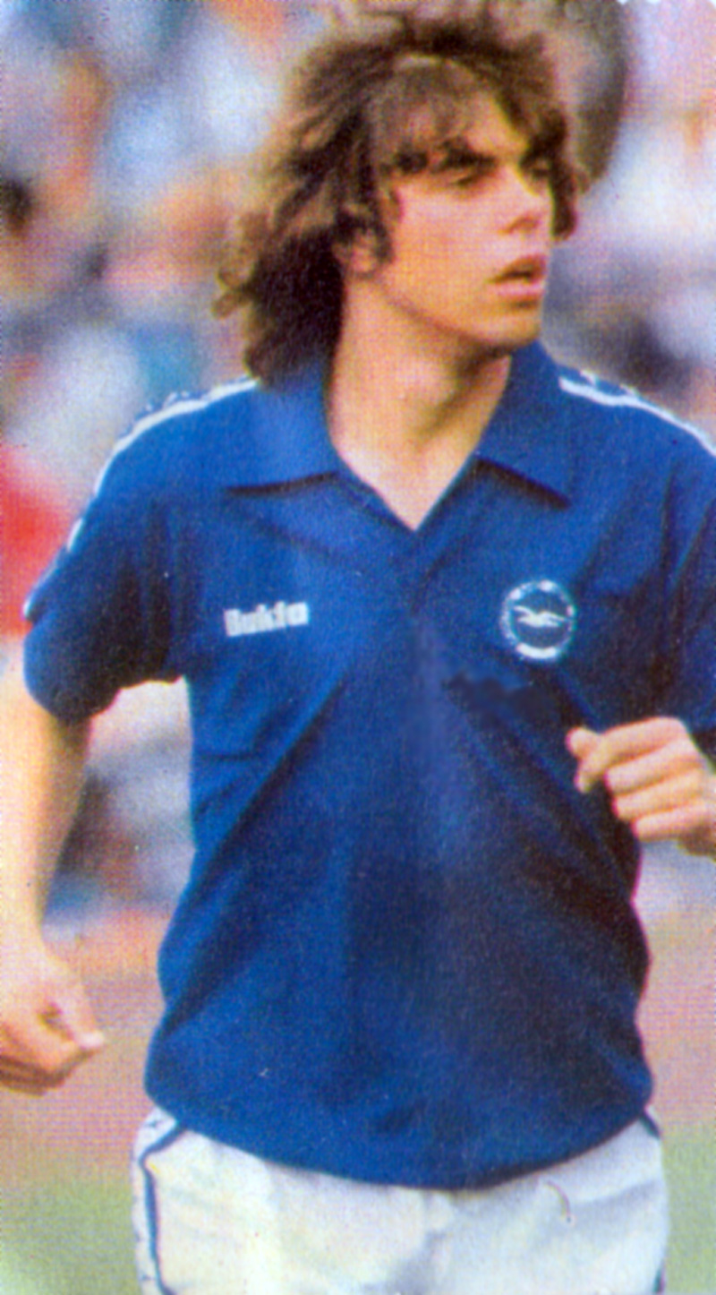
This blue number was very smart indeed, with the white Buks down the sleeves looking rather like the white seagull on the new round crest. It made its debut on the opening of the league campaign, at the Dell, for Brighton’s well-earned 1-1 draw with Southampton. By the time of Albion’s match at Sunderland on 1st October 1977, Peter Ward had hit a rich vein of goalscoring form, with four goals in three matches.
At Roker Park, this exquisite first half goal was testament to Wardy’s close control, speed on the turn and deadly finishing:
The strike made the score 2-0 and put Albion on top of Division Two, at the time the highest Football League placing in the club’s history.
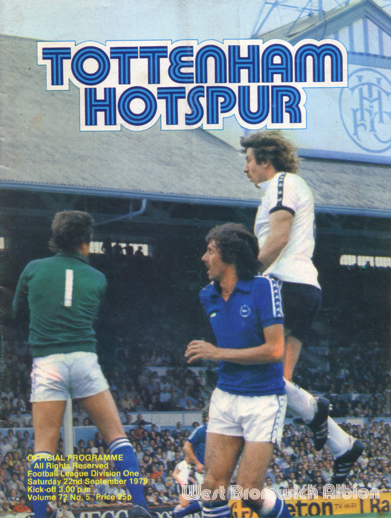
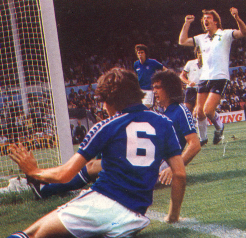
By the following month, the blue away kit was worn, strangely, with white shorts and red socks for the famous 0-0 draw with Tottenham Hotspur in November 1978, in front of 48,613 fans, still Albion’s highest ever league attendance. Hate to say it, it made us look like Portsmouth, although we were far, far better than the Pompey side of that time!
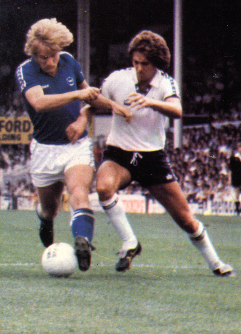
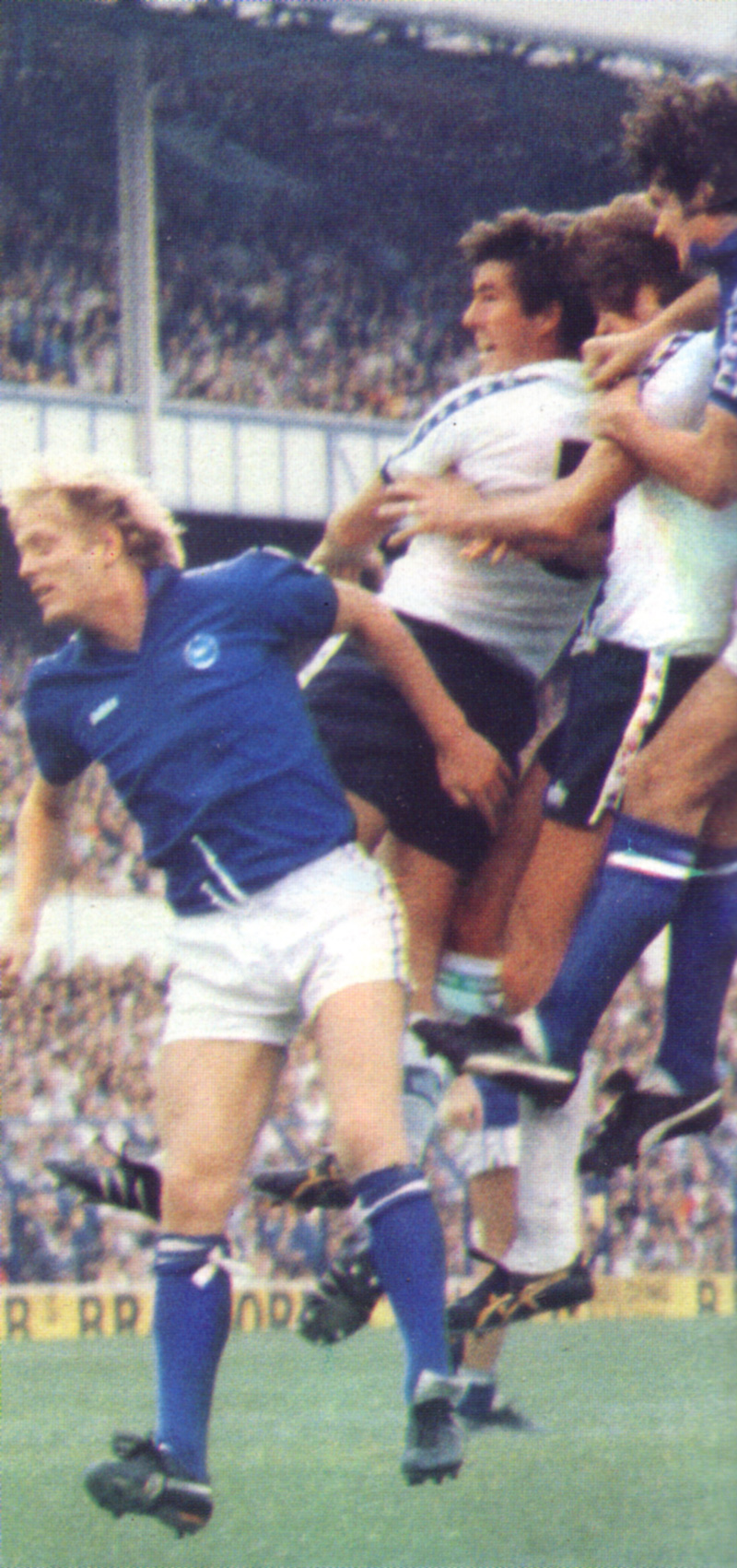
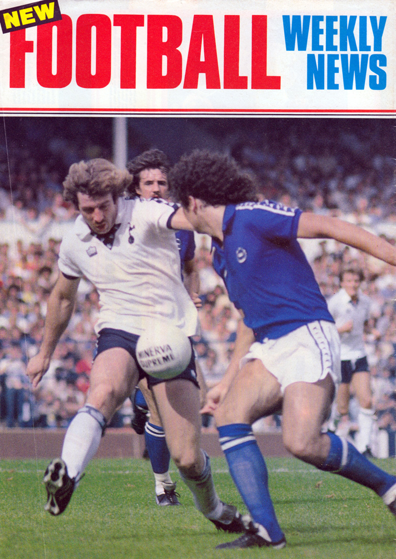
Two seasons later, in September 1979, the Spurs v Albion match at White Hart Lane was a First Division fixture, which the Seagulls lost 2-1 despite Horton’s goal. Here’s some images from the game:
In the summer of 1980, Adidas had taken over the deal for supplying Brighton’s kits. After three seasons, the blue Bukta away shirt was no more but the spirit of it lived on: the new Albion home shirt was a plain royal blue jersey.
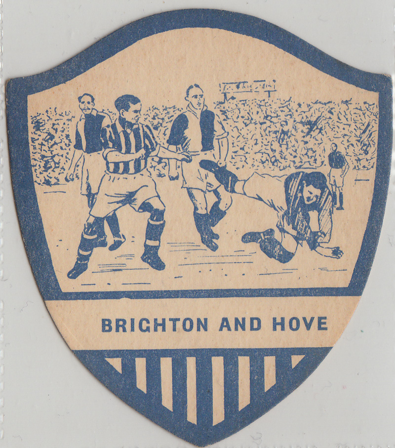
These magnificent coaster-sized cards were leant to me by Nick from Fishersgate. I trust no-one was wasteful as to actually used them as beer mats, although that would make existing ones even rarer, pushing up their value, which might be good news for those who own some.
From the text printed on the back of four of these, it appears that they were issued by J. Baines in Bradford, at 82 Oak Lane or 15 North Parade. So proud of his status as ‘Sole Inventor and Originator of the Famous Packet of Cricket and Football Cards’, that his invention was registered at the Patent Office, with ‘Trade mark No. 197161.’ Yes, because obviously football and cricket cards did not exist before his!
In fairness, although the idea of collector cards was not due to his ‘Eureka’ moment, J Baines’ ones were cut in such extravagant shapes of which I have never seen of football cards before. Take this natty blue and beige number:
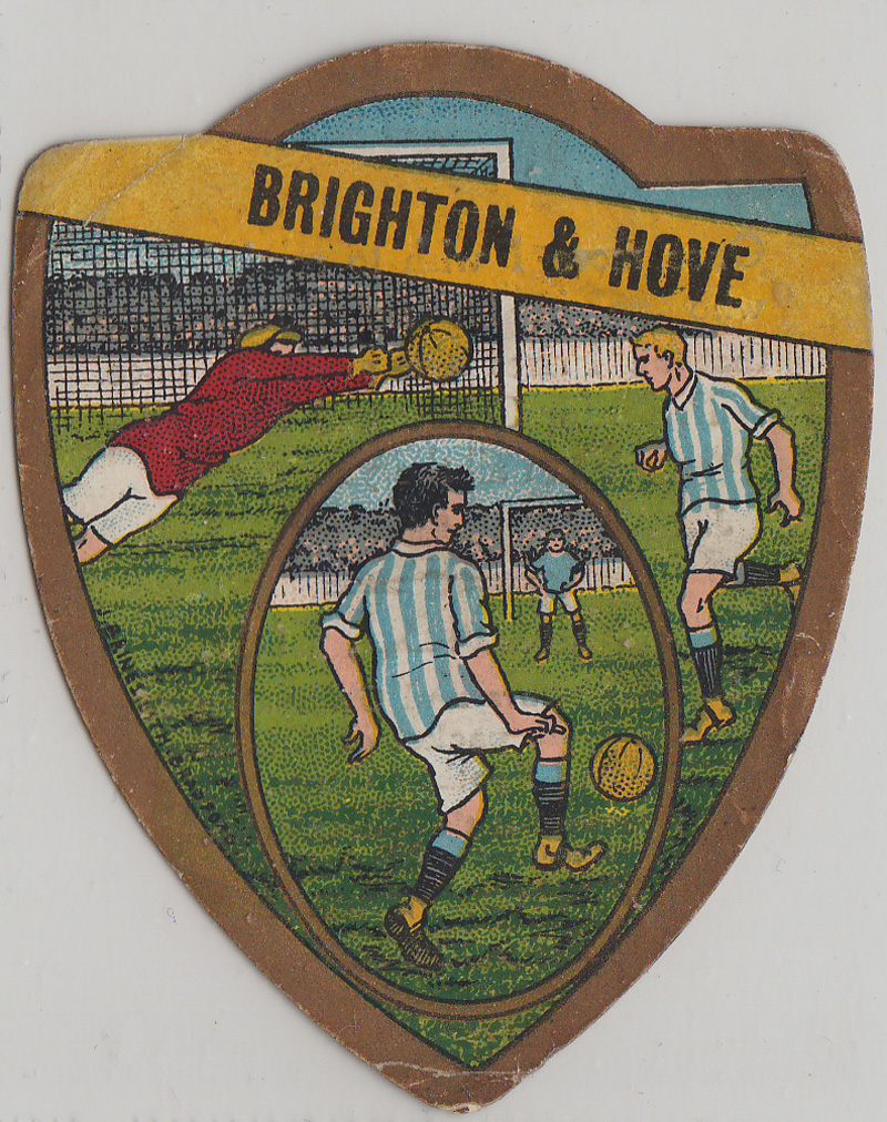
This full colour one here, my favourite, is an absolute beauty, and suggests our Argentina-style kit of the 2000s was not a wholly new idea:
Its reverse has the rather peculiar words:
Once more I wish to remind Boys who go in for my Competitions that all Prizes are given at once. Prizes for Cricket and Football are given all year round. J BAINES’ decision to be final.
Quite what the nature of these competitions were is not clear.
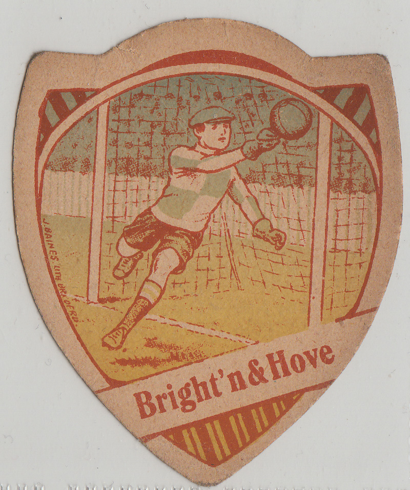
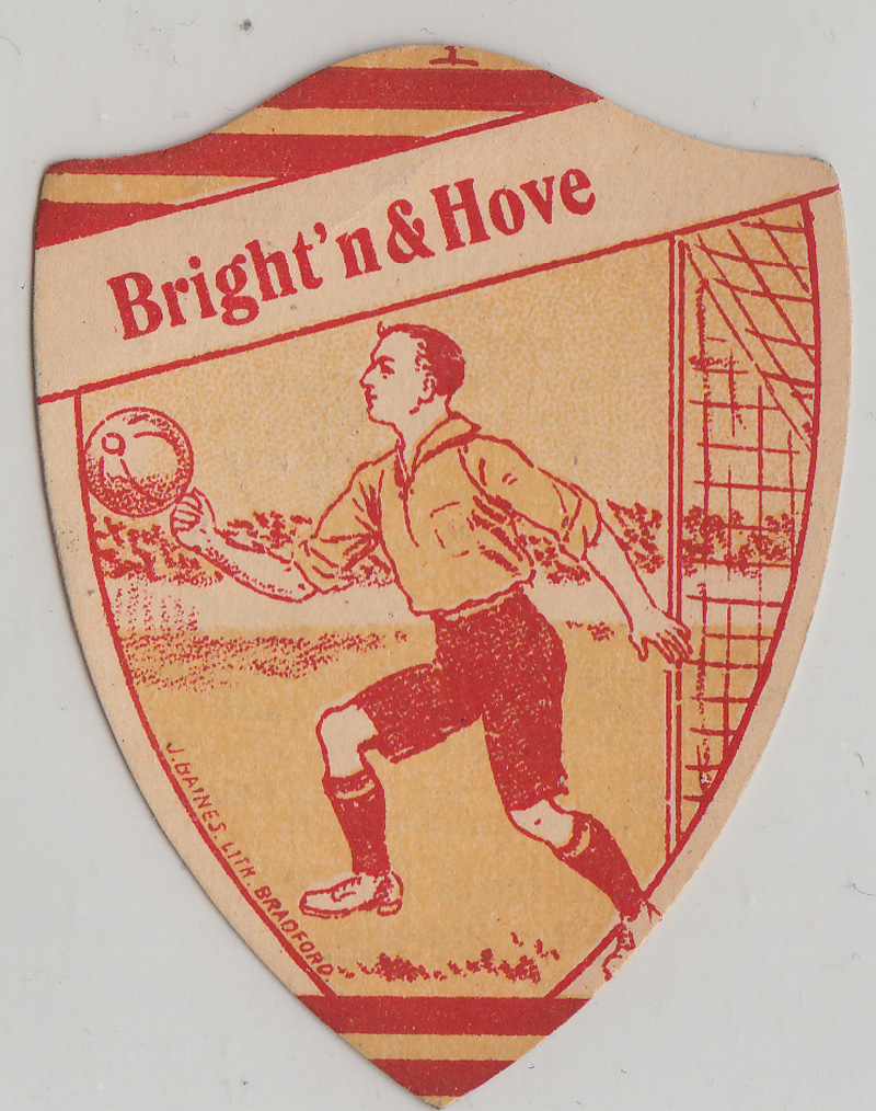
The next two have the abridged name ‘Bright’n&Hove’, with a goalkeeper in a chequered shirt. I wonder if an Albion keeper has really ever worn such a design:
Again, there is a special notice on the back of each:
‘If shopkeepers find any difficulty in getting our Packets, kindly write direct to Bradford, when they will get prompt attention. ESTIMATES GIVEN FOR ANY QUANTITY.’
‘Jerseys and Shirts will be sent in all cases if the instructions on Show Bills are strictly followed, as there are several competitions. Please examine your Cards before sending to prevent any disappointment.’
Despite the urgent nature of the messages, I’m still none the wiser as to what J Baines was in the business of. Where they a sports collector card company? A sportswear company? We might not ever know.
Still, the series continued with these two, finally giving the ‘Albion’ part of our club’s name a mention in the gold, vase-shaped design:
I’m not sure what decade these came out. If anyone would like to make an educated guess, please do.
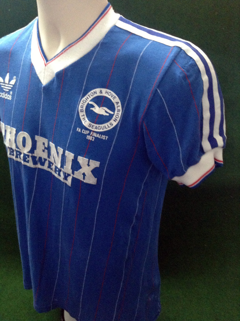
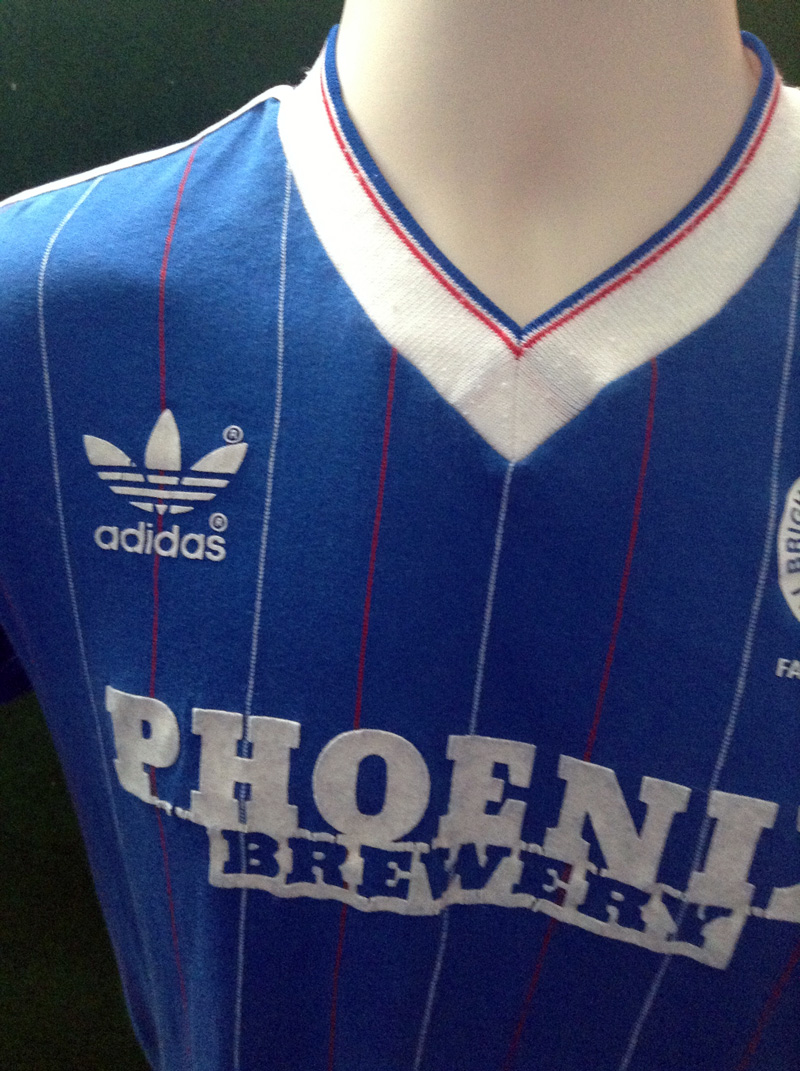
You may notice that this pin-striped beauty from 1983/84 is also the shirt in the logo of The Goldstone Wrap. I bought it from Phil Shelley of Old Football Shirts.
It was an updated version of the elegant number that Brighton wore at the 1983 FA Cup Final. If you look very closely at images from the Final against Manchester United, you can see that the V-neck and shirt cuffs of the Brighton players were plain white. By the start of the 1983/84 season, however, a very smart thin blue and red trim was added by adidas, as you can see here.
There are some other lovely touches to the shirt, such as the red pinstripe running through the badge behind the seagull on the crest. The pinstripes also ran through the cut out letters of ‘Brewery,’ following the sponsorship deal clinched with Phoenix Brewery in October 1983. Before the deal, Albion had started their return to Division Two sponsorless, as the three year deal with British Caledonian Airways had expired at the end of 1982/83.
‘FA Cup Finalist 1983’ is proudly added under the crest. Of course, the classic three stripes running down the sleeves for that vintage Adidas vibe and the sponsor’s logo, crest and manufacturer’s logo are very tastefully balanced together. One surprising aspect of the shirt is that it is made of cotton rather than polyester. In 1983/84, the shirt was usually worn with white short and blue socks, and it received national exposure in January 1984, when ‘The Big Match Live’ broadcasted Brighton’s famous 2-0 victory over Liverpool in the FA Cup, with Eric Young, Steve Penney and Tony Grealish giving Liverpool a torrid time. It may have helped that they were wearing a bit of #kitporn as classy as this!
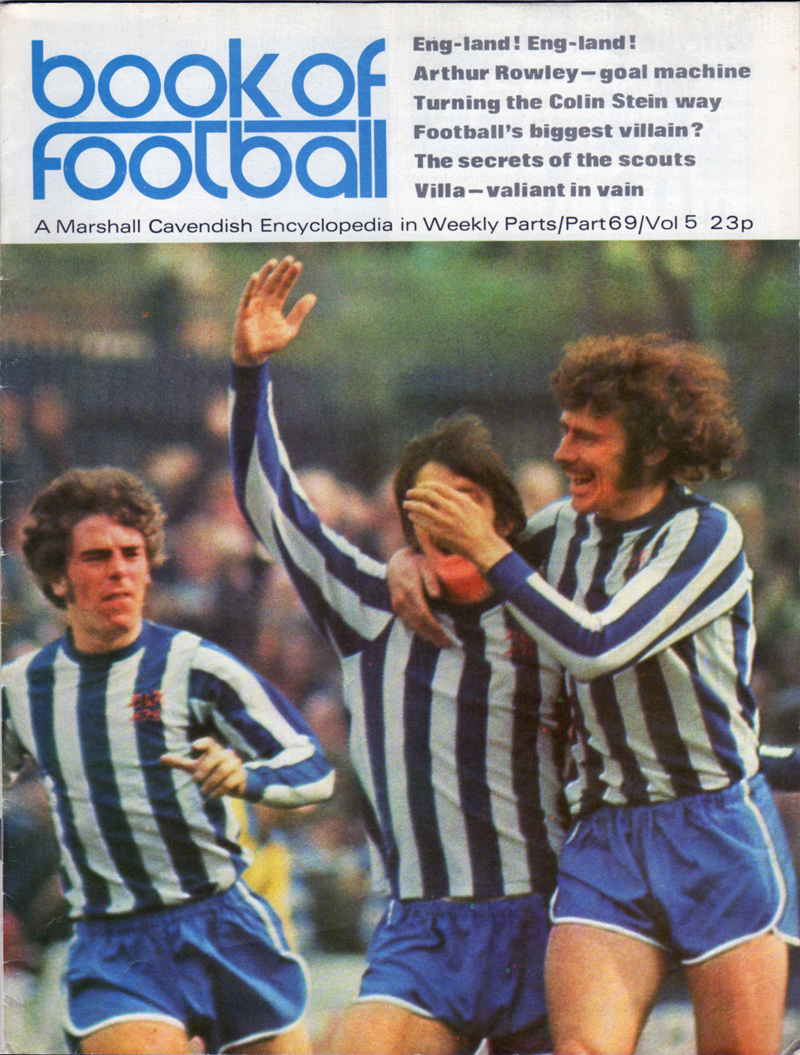
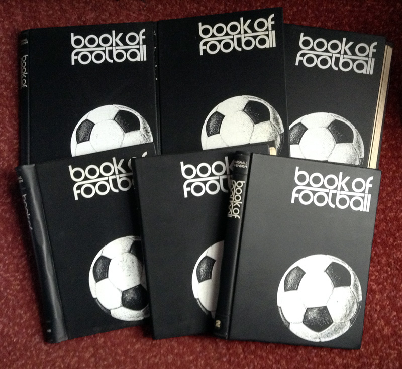
As covered in a previous post about the life and times of Norman Gall, the Book of Football was a weekly partwork from the early 1970s, building up to an authoritative encyclopaedia of the game over the course of 75 weeks. I bet, if you around then and had collected every issue over a year and half, you’d quite rightly have been very satisfied with yourself. And wouldn’t think anything of it as you proceeded to bring all six volumes down the pub and proceeded to bore your friends with your newly acquired knowledge on football tactics, club histories and goalscoring feats…!
Nearing the end of the completion of Marshall Cavendish’s series, came Part 69 which featured Peter O’Sullivan, Willie Irvine (face partially concealed) and Kit Napier, three happy men in their running shorts, celebrating an astonishing team-goal in March 1972.
As the inside cover says:
One of the highlights of the 1971-72 season for Brighton. Kit Napier congratulates Willie Irvine after his goal which gave Brighton the lead in the vital promotion match against Aston Villa. Brighton won 2-1 and Irvine’s fine goal was featured on Match of the Day.
And what a diamond of a goal it was!
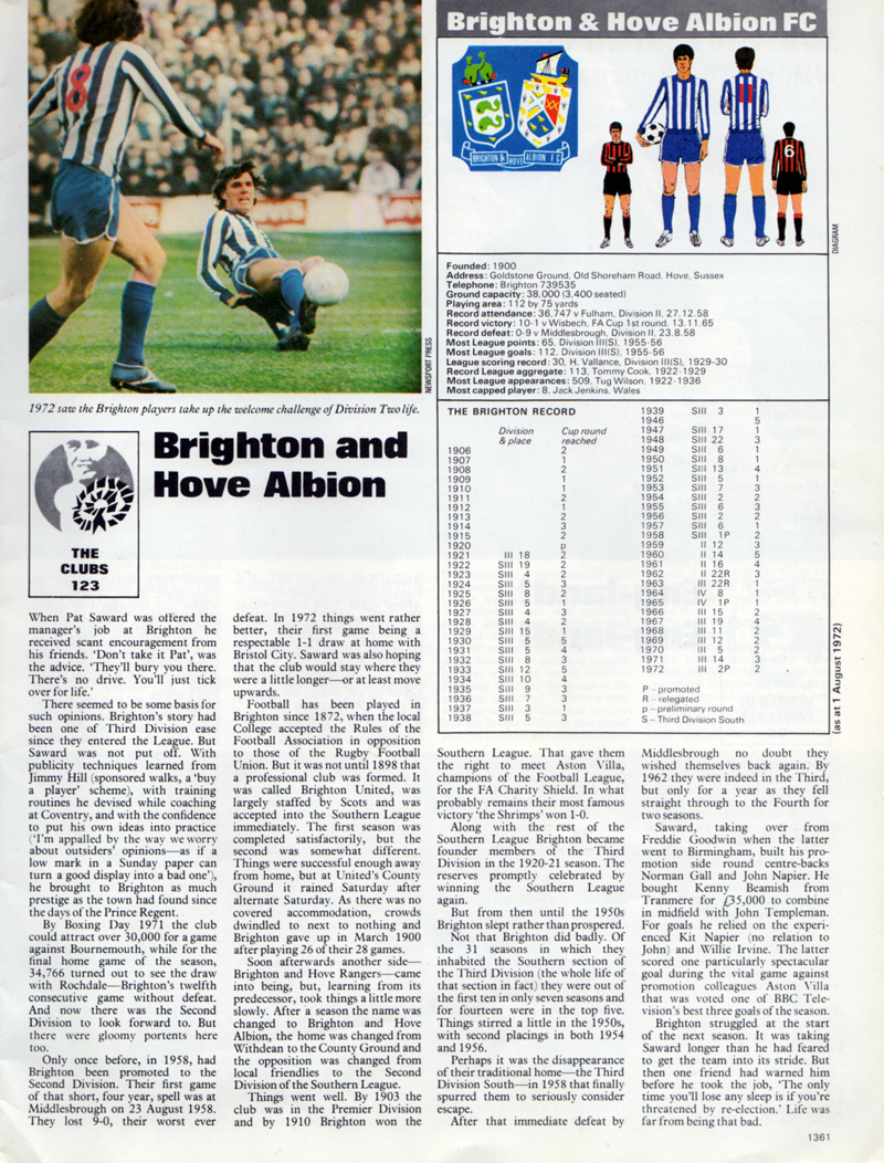
Inside we are treated to another colour photo (of Kit Napier, number 8, and Ken Beamish, on the floor) plus a potted history of Brighton & Hove Albion. Written very concisely, it charts a local Brighton college’s acceptance of the Rules of Association Football in 1872 (yes, the dark ages before Brighton & Hove Albion were formed), through to the creation of the club, the Southern League days, Brighton winning the Charity Shield (also against Villa), through to victory in Division Three (South) in 1958, to Pat Saward’s then current struggles as his charges flopped in the early months of Second Division football in 1972/73.
There are also some excellent illustrations of the coat of arms the club used in the 1960s and early 1970s, as well as some mostly accurate drawings of the home and away kit (persnickety alert: the only omissions were the red lettering on the home shirt and some white hoops from the away socks). Together with Brighton’s season-by-season record in the League and FA Cup, it all makes for a splendid portrayal of what the Albion was like back then and its relative stature to other club within the football world. And if you want more, there’s all the other 74 parts you can read too!
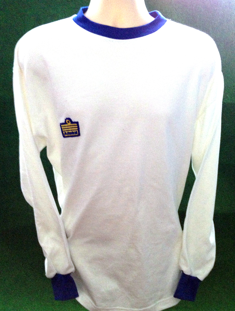
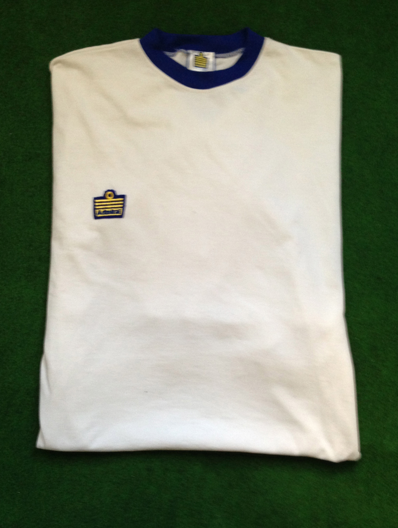
This is a pimped-out version of the very ‘plain Jane’ Brighton home shirt from Peter Taylor’s first season in sole charge at the Goldstone in 1974/75. As you can see, not only did Albion fans have to put up with their manager Brian Clough defecting to Leeds, but our traditional and beloved blue and white stripes were ditched in favour of a design by Admiral that echoed the kit worn by the Elland Road side.
To add a bit of flourish, the shirts were originally worn with white shorts that had two blue stripes running down the side and with white socks featuring two blue rings.
While controversial, the move to all-white had a precedent at the Goldstone earlier in the decade. Before Brighton boss Freddie Goodwin had left for Birmingham City in the summer of 1970, he had instigated a change to the team’s colours to this aesthetic, perhaps in admiration of Leeds or maybe he thought it would help us play like Real Madrid. Or could it be that he just liked how milky-white kits shone under floodlights during night-time matches? Whatever the reason, that radical change lasted for a single season, however, in the first campaign of the Pat Saward era.
Just as under Pat Saward in 1970/71, Brighton’s season in 1974/75 was one of struggle in Division Three, with the threat of relegation being averted by the end. Under the watch of Peter Taylor, the all-white affair was worn by the likes of Ian Mellor when he scored on his League debut for Brighton in an opening day win against Crystal Palace in August 1974 and by fellow striker Dave Busby who became the first black player to play for the Albion when he came on as a substitute against Reading in the League Cup in September. Humiliatingly, the shirt was also worn with blue shorts for the 1-0 home defeat in the FA Cup by non-league side Leatherhead in January 1975, with Chris Kelly, ‘The Leatherhead Lip,’ here giving the Albion defenders the runaround:
At least the white shirt from the earlier season had the letters ‘B&HAFC.’ This one of 1974/75, with the identical blue round neck and shirt cuffs, had nothing that identified it as belonging to Brighton & Hove Albion. Stingily, it also offered none of the design innovations that Admiral became synonymous with during the decade, such as tramlines down the shirts and shorts …or even sock tags which featured mainly at Elland Road in kits manufactured by Admiral (If you’re going to copy Leeds, at least copy sock tags!) And yet, as if to rub your nose in it, Admiral did manage to get their own logo on.
Strangely, given the plentiful supply before, there’s a paucity of colour photography of Brighton & Hove Albion players during 1974/75, apart from this photo by Crystal Palace fan Paul Wright which understandably is from quite far out, so you can’t see the detail on the shirt. So, from black and white photos, I was unable to ascertain the colour of the Admiral logo until Phil Shelley from Old Football Shirts was helpfully able to confirm it as yellow with a blue outline, having chatted to a few ex-Brighton players at the Alan Mullery special celebration dinner event last year.
Powered with this knowledge, I ordered a blue round-necked white shirt from Toffs. Then I proceeded to get a yellow Admiral logo unstitched from another shirt and sewn on to it although, judging from photos, I think the originals had the logo as an ironed on transfer. I even got the Admiral neck label added on to make it look more authentic when it is anything but!
Although it could be easily mistaken for a white polo necked t-shirt with a badge ironed on, I do wonder how much an original Brighton home shirt from 1974/75 is worth. Not that there’s much chance of an original surviving the lifespan of being used in competitive matches, then in reserve matches, then as training kit, then probably discarded due to wear and tear. When I contacted Dave Busby, who made three appearances during that season, he said: “We were never allowed to keep kit. It all had to be accounted for.”
Unless any found their way out, what you are looking at could be the only 1974/75 Brighton home shirt in existence, albeit as a reproduction.
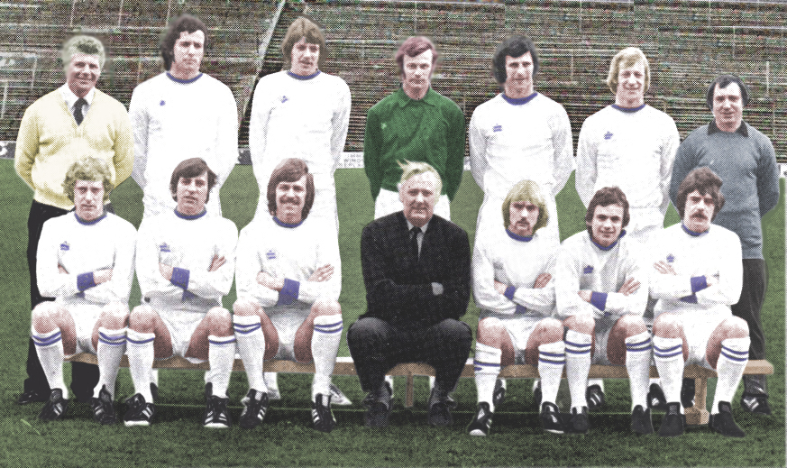
Back row: Brian Daykin (assistant manager), Andy Rollings, Ian Mellor, Peter Grummitt, Graham Winstanley, Jim Walker, Ken Gutteridge (coach)
Front row: Harry Wilson, Ernie Machin, Fred Binney, Peter Taylor (manager), Tommy Mason, Tony Towner, Peter O’Sullivan
The Football Attic‘s entertaining podcast on football books last week stirred my interest in a book called ‘Club Colours,’ by Bob Bickerton, all about football kits.
As the price was listed as just a penny on Amazon, I decided it was worth a buy. Inside, every club in the Premier League or Football League is given a double-page spread where the history of its kits is covered with a concise article next to a player in action, illustrated with what looks like… yes… coloured pencils! It makes for a rather eye-catching effect, beautiful in some ways, although as the podcast mentioned, it is perhaps not the most accurate way of capturing the finer detail of a design. Nevertheless, here is the first of the pages on Brighton & Hove Albion, and you can see that the 1983 FA Cup shirt is pretty much spot-on, except for the absence of the adidas logo and ‘FA Cup Finalist 1983’ writing underneath the club crest.
On the page that follows, you can see eight of the respective club’s designs down the years are drawn with fine-liner, pencil and crayons within the boundaries of a cigarette card template. Even so, it’s rather questionable whether Brighton did have red, blue and white stripes or wear red socks as part of a home kit. I can find no evidence of this some years ago, having done some research on this for the creators of the Historical Kits website, a website profoundly inspired by Bickerton’s book.
And if I want to be picky, the accuracy of some of the modern kits looks a bit out without the shirt sponsor or manufacturer’s logo. Perhaps this may have been the result of barriers involved in getting commercial clearance. Even so, this doesn’t explain why the blue shirt with white sleeves kit from the 1960s has a V-neck rather than a round collar. The date is somewhat off too, and similarly it’s the case with the 1970-1976 kit which seems to feature a mishmash of shirts, shorts and socks of different seasons in that period. If you have a look at Historical Kits, you will see what I mean!
On other pages, covering some trends and new ideas in football shirts, Brighton’s famous deckchair shorts are given a viewing in double-spread entitled ‘Innovators and Innovations’:
The club also features in a section called ‘Hated Away Strips’. Bickerton comments:
The ultimate in this category is the famous red and white wiggly lines version, a pattern which traversed both shirts and shorts of Brighton outfits in 1992. Certainly, such was the strength of the irregular pattern that it was difficult to focus on the shape of the player in action.
The illustration of this kit most pointedly reveals the limitations of drawing modern kits with coloured pencils as it doesn’t quite capture the detail of the pattern. As a result, it’s clear that the vector-based software illustrated kits of the Historical Kits website, and John Devlin’s magnificent ‘True Colours’ books and site, have somewhat eclipsed what ‘Club Colours’ set out to do. Even so, this is a splendid book that is undoubtedly written with a lot of love and fascination for its subject matter, and it provided a valuable place of reference at a time when there weren’t that many books or websites on football shirt design. Definitely worth a penny of anyone’s money!
In the Brighton v Stockport programme from October 1993, marketing manager Terry Gill writes:
The new Albion replica strips are proving very popular and we will be delighted to see any supporters in the shop to sort out your own size.
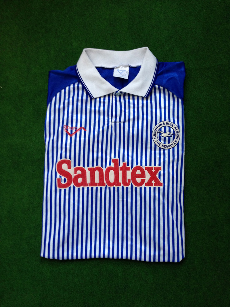
That’s funny, because I distinctly remember that the 1993/94 home kit as being one of the most unpopular ones that Brighton have had down the years!
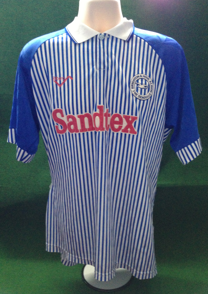
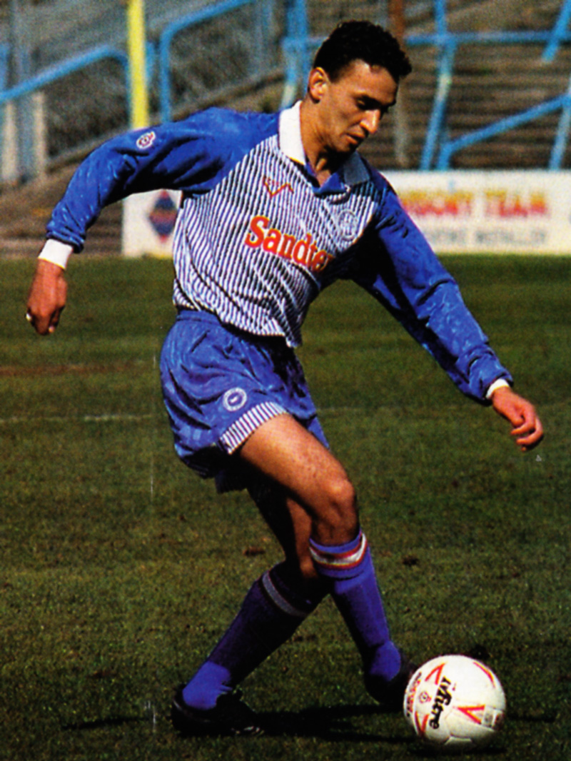
Retaining Ribero as the shirt manufacturer, the club entered the new season with a different shirt sponsorship deal. Out went TSB, in came Sandtex (or mispronounced as ‘Semtex’ by various jokers at the Goldstone. OK, that’s probably my teenage friends and me at the time!). Proving fluent in marketing-speak, Gill claimed: ‘The name brands what is arguably the top masonry paint available in this country and we are delighted that AKZO have backed us this season through the Sandtex brand.’
Leaving aside the questionable business wisdom of trying to increase the sale of masonry paint by entering into a commercial partnership with a struggling Football League club, the red Sandtex logo gives the shirt an unwanted ‘Tesco Value’ connotation when matched with the unfamilar pinstripes emblazoned vertically down the body and sleeve cuffs. By contrast, the royal blue sleeves, shorts and socks echoed the all-blue affair of 1980-83. It was certainly a very original design and was neither one thing nor another. But it remained largely unloved by the Goldstone faithful.
Despite the best efforts of the likes of Kurt Nogan (above), Jimmy Case, Steve Foster and on-loan Paul Dickov, memories of the kit were hardly helped by being associated with success. This is even though Brighton eased from a relegation battle in Division Two in the dying days under Barry Lloyd to mid-table mediocrity with Liam Brady at the helm in the New Year.
The main reason for the cold reception was that it just didn’t look much like a Brighton & Hove Albion shirt. This was especially the case when watching the players from afar as the pinstripes combined to look more like a pale blue. And perhaps lack of success did play a part, in so far as not providing a buffer for the discontent with the design. Although there were some murmurings, fans were able to accept the transition from traditional stripes to all-blue in the 1980s when Albion were a minor force in English football. But with the going getting increasingly tough, such as when Brighton were second from bottom in early December, there was a general sense that supporters wanted a team in traditional Albion colours that they could unite behind.
After one season, this outlandish number was ditched in favour of the kind of kit that was quintessentially Brighton & Hove Albion.
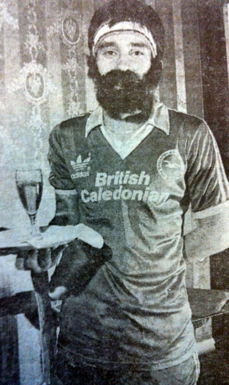
I wish I could explain what this photo was all about but sadly it’s become detached from the story in the local newspaper. If anyone knows or would like to guess, feel free to add a comment!
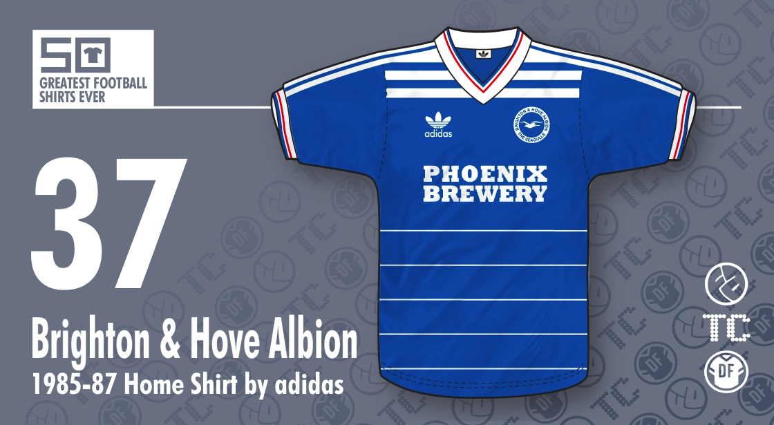
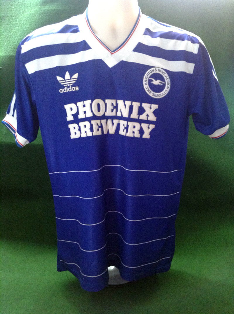
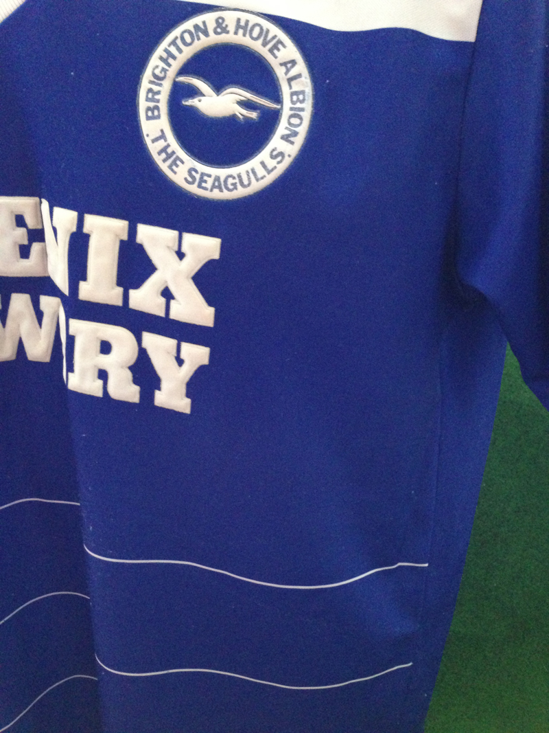
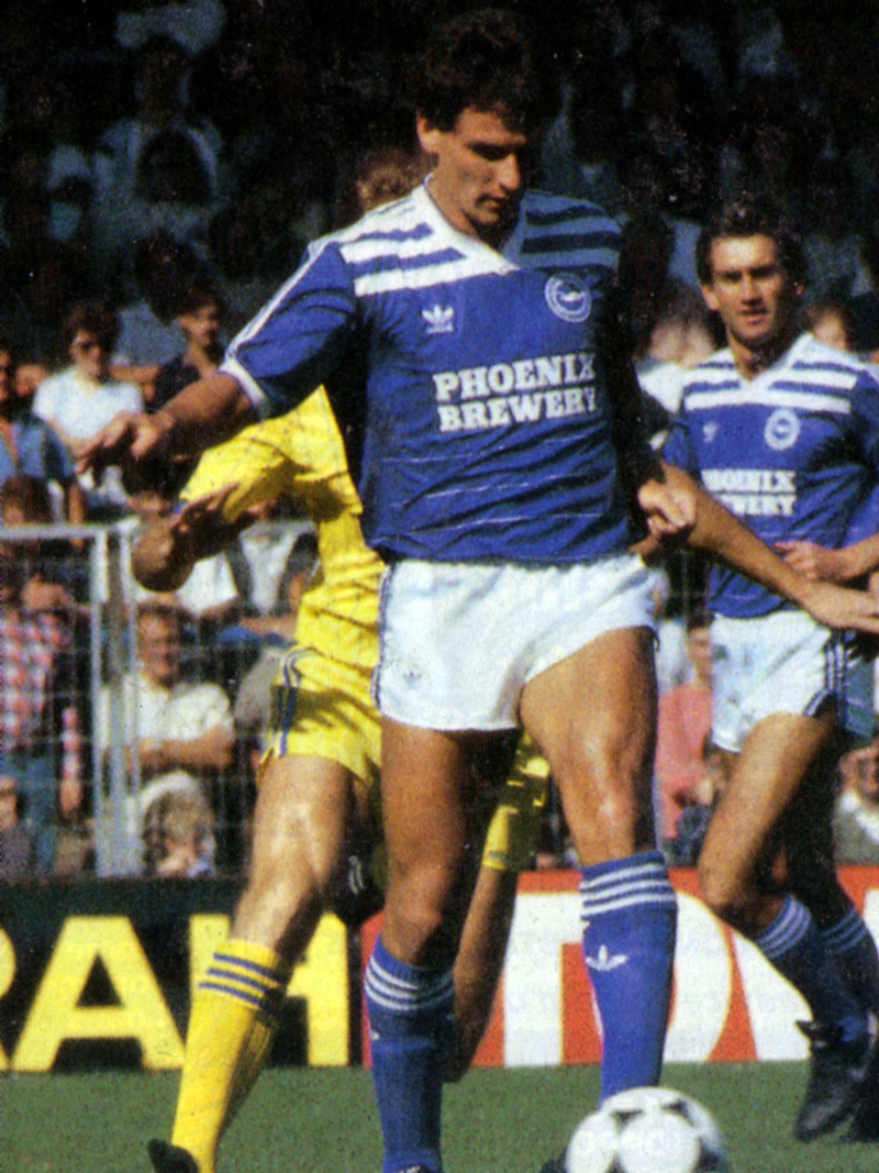
A much loved home shirt design from the mid-1980s. It was mostly worn with white shorts and blue socks, but even in some home matches, such as the FA Cup 5th Round Replay with Peterborough in 1986, Albion wore this with white shorts and socks. Looked great either way! This shirt design lasted two seasons at Brighton, one with the Phoenix Brewery sponsor and then with the NOBO lettering.
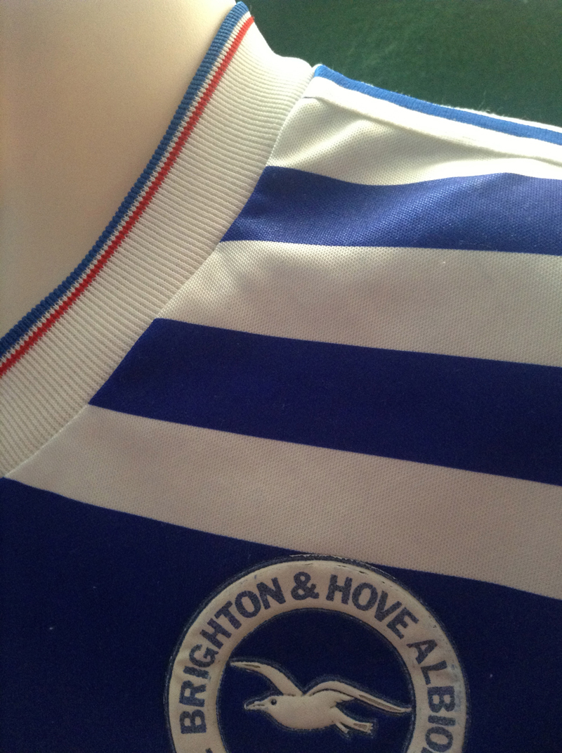
The thin blue and red stripes on the V-neck collar and shirt cuff were retained from the previous design, as were the classic three white stripes down the sleeves. With those magnificent three bold vertical stripes on the sides of the collar, though, this showed adidas still had striking new ideas to play around with. Perhaps with such a range of elements, it might have looked a mess. Here, though, it is neatly executed and makes for a winning, pleasing combination.
On the pitch, with this home kit, Brighton, under Chris Cattlin, also seemed to have found a winning formula. With Terry Connor and Dean Saunders firing all cylinders up front (even though Justin Fashanu wasn’t), they were pushing for a return to Division One before a slump from late March 1986 onwards sent them to a chastening mid-table finish. The fall cost Cattlin his job.
Still, the team looked pretty stylish, even as they waved their promotion dreams goodbye! If you look closely, you can see that the badge and the sponsor logo were embossed. Another nice touch! Much more than this, the balance and positioning between adidas logo, club crest and shirt sponsor show a degree of thought and taste that is often missing from many replica shirts nowadays.
Also, I rather love the horizontal pinstripes at the bottom of the shirt – a contrast to the vertical, thinner ones of the previous jersey. The horizontal stripes reprise those of the shirt that France wore during the European Football Championship in 1984 on their home turf. While Steve Penney, Danny Wilson and Dennis Mortimer (below, righteously winning the ball against an opposition player who dared to go for the now outmoded vertical pinstripes!) made immense contributions to that 1985/86 season, there’s no doubt about it: we could have done with Michel Platini, Alain Giresse and Jean Tigana in our side!