
In the Brighton v Stockport programme from October 1993, marketing manager Terry Gill writes:
The new Albion replica strips are proving very popular and we will be delighted to see any supporters in the shop to sort out your own size.
That’s funny, because I distinctly remember that the 1993/94 home kit as being one of the most unpopular ones that Brighton have had down the years!
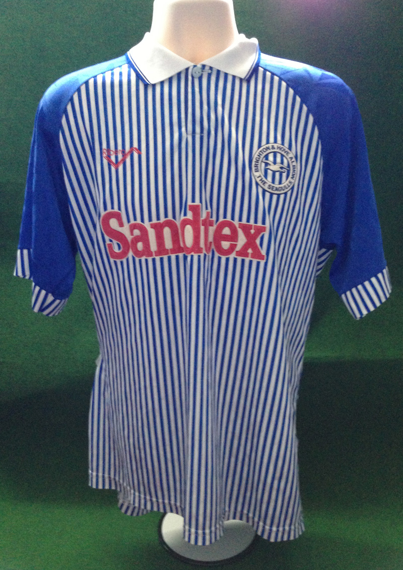
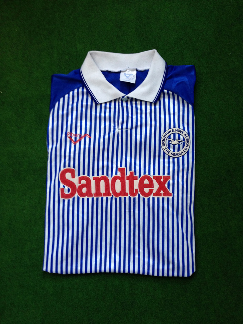
Retaining Ribero as the shirt manufacturer, the club entered the new season with a different shirt sponsorship deal. Out went TSB, in came Sandtex (or mispronounced as ‘Semtex’ by various jokers at the Goldstone. OK, that’s probably my teenage friends and me at the time!). Proving fluent in marketing-speak, Gill claimed: ‘The name brands what is arguably the top masonry paint available in this country and we are delighted that AKZO have backed us this season through the Sandtex brand.’
Leaving aside the questionable business wisdom of trying to increase the sale of masonry paint by entering into a commercial partnership with a struggling Football League club, the red Sandtex logo gives the shirt an unwanted ‘Tesco Value’ connotation when matched with the unfamilar pinstripes emblazoned vertically down the body and sleeve cuffs. By contrast, the royal blue sleeves, shorts and socks echoed the all-blue affair of 1980-83. It was certainly a very original design and was neither one thing nor another. But it remained largely unloved by the Goldstone faithful.
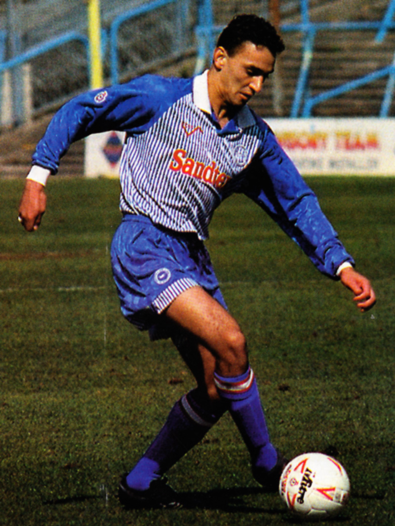
Despite the best efforts of the likes of Kurt Nogan (above), Jimmy Case, Steve Foster and on-loan Paul Dickov, memories of the kit were hardly helped by being associated with success. This is even though Brighton eased from a relegation battle in Division Two in the dying days under Barry Lloyd to mid-table mediocrity with Liam Brady at the helm in the New Year.
 The main reason for the cold reception was that it just didn’t look much like a Brighton & Hove Albion shirt. This was especially the case when watching the players from afar as the pinstripes combined to look more like a pale blue. And perhaps lack of success did play a part, in so far as not providing a buffer for the discontent with the design. Although there were some murmurings, fans were able to accept the transition from traditional stripes to all-blue in the 1980s when Albion were a minor force in English football. But with the going getting increasingly tough, such as when Brighton were second from bottom in early December, there was a general sense that supporters wanted a team in traditional Albion colours that they could unite behind.
After one season, this outlandish number was ditched in favour of the kind of kit that was quintessentially Brighton & Hove Albion.
